“Looking For You”
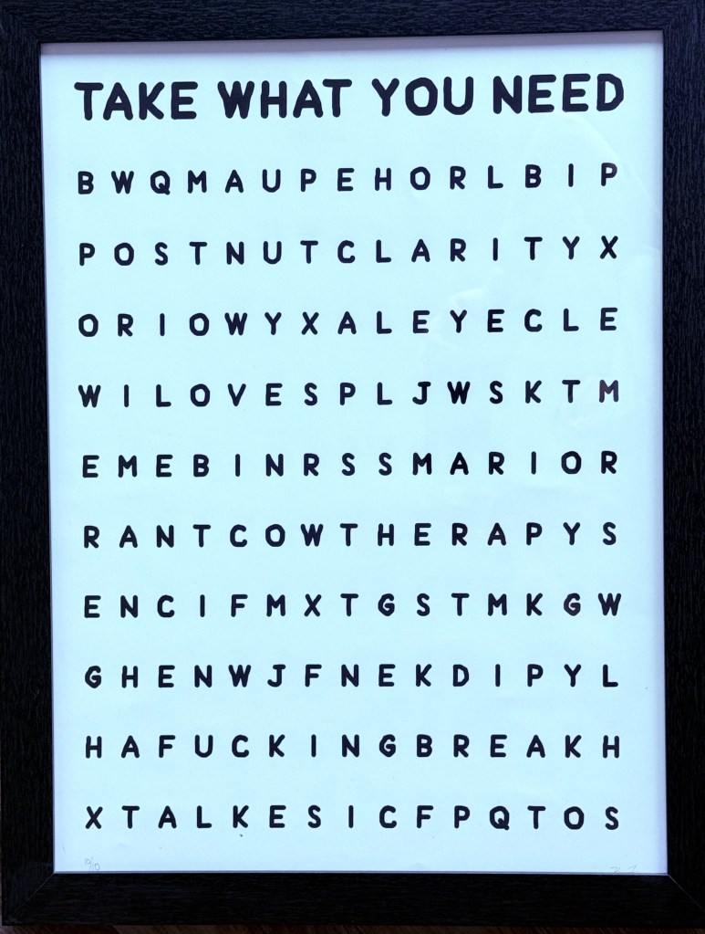
24″ h x 18″ w, digital print on 300 GSM art paper (signed, numbered 10/10) (2024)
Law is sometimes thought of as artless, but I’ve never found that to be the case. One of my law school classmates, Natalie Shapero, is now a professional poet, and I absolutely love an interview she did with a poetry magazine where the interviewer was clearly set on viewing law as a creative dead zone and Natalie kept surprising her by insisting on her legal training as generative and highly influential on her poetic product.
All of this is to say that it’s perhaps not surprising that I, as a lawyer and law professor, deeply enjoy word art. It is a genre I first was exposed to via Mel Bochner, and while for now Bochner’s works are mostly out of my price range, I was fortunate to come across the emerging products of Kansas City-based Braxton Fuller whose work scratches some very similar itches.
My ongoing “joke” suggestion to my wife (which, to borrow from Frankie Dart, is “gradually becoming less of a joke”) was to put this above our baby’s crib to introduce him to letters and words. “Cow”, “Love”, “Nut” — I frankly don’t see the issue?
Actually, what I really like the idea of is Nathaniel having this in his room for a decade and then looking at it as a twelve-year old and being like “wait a minute….” To keep on with the Community references: “That won’t pay off immediately, but it’s gonna pay off.”
(So far the missus has not budged on this. Oh well).
“Nathaniel’s Compass”
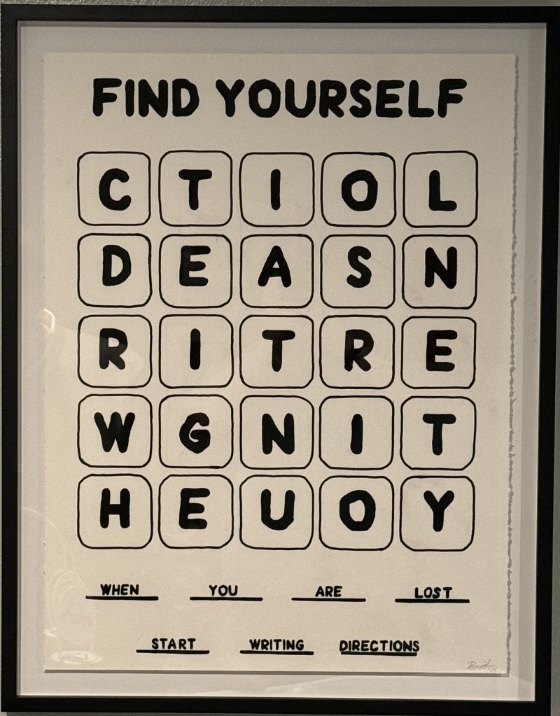
30″ h x 22″ w, acrylic on paper (signed) (2025)
For my first Father’s Day as a dad, Jill had this commissioned for me on behalf of Nathaniel. Braxton does a lot of word art, but he had never done a piece centered around my favorite word game: Boggle!
We wanted something that could grow with Nathaniel, but as one might have surmised from “Looking For You”, Braxton’s art is often more than a little NSFW. So the task was to come up with something that fit into his artistic profile but which we could also hang in a child’s bedroom without having CPS called on us (while also not being so cutesy that Nathaniel would outgrow it).
We thought this painting nailed the assignment–it’s fun and bold, and kid appropriate without being kidsy. And yes, I’ve already started looking for all the words beyond the one’s written out on the bottom (was “Dear Son” an easter egg? I don’t know).
“The Main Character of this Story Fucking Sucks”
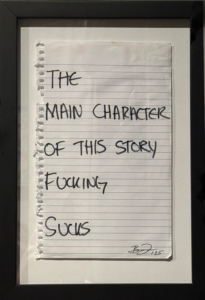
9.5″ x 6″, drawing on notebook paper (2025)
This was included as a bonus with “Nathaniel’s Compass.” Once again, I appreciate its strong 2025 energy. The main character of this story does fucking suck! Thanks for noticing!
“A Work that Inspired an Entire Series (Be Like This Study!)”

20″ h x 16″ w, acrylic on canvas (2022)
“Show Your True Colors” (Study)
20″ h x 16″ w, acrylic on canvas (2023)
“This is a Safe Place (Study)”
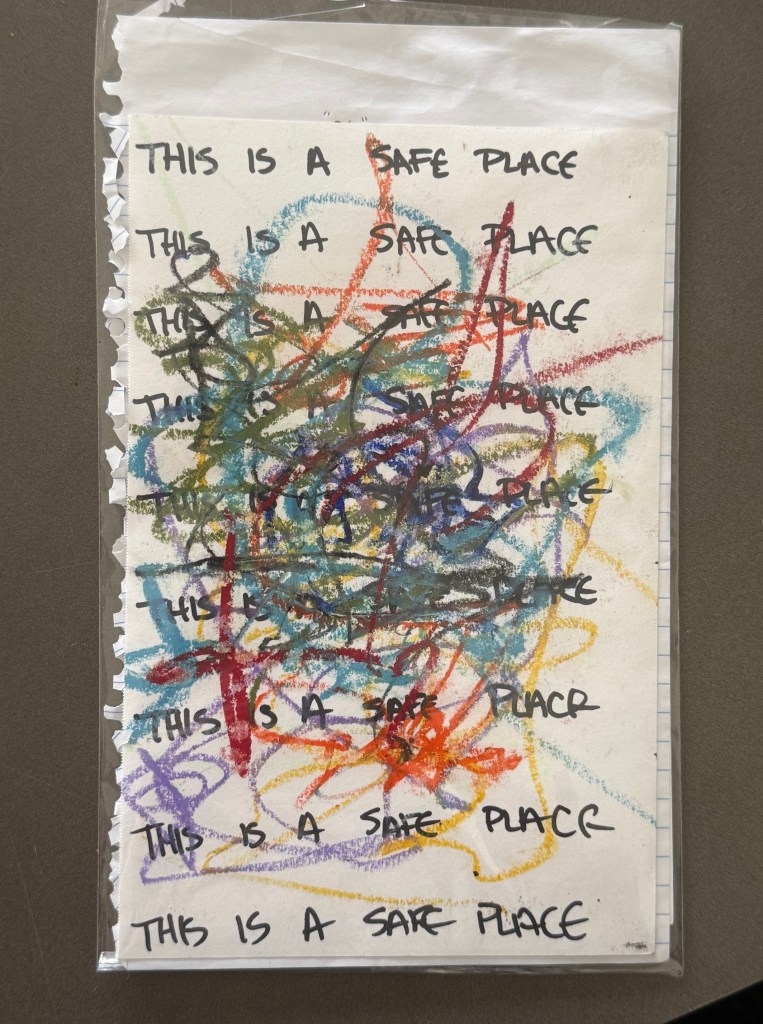
8.75″ h x 5.5″ w, drawing on paper (n.d.)
We got these three works as a set. My wife preferred the more pictural works (though who couldn’t be inspired by a Work That Inspired an Entire Series–we should all Be Like That Study!). Unsurprisingly, I was more drawn to the word art.
The idea of “safe spaces” and “safe places” really came in for a beating in recent years as part of the anti-“woke” backlash. The claim was that “safe spaces” were unrealistic, an attempt by fragile snowflake students to avoid toughening up and encountering the real world. But what we’ve actually seen emerge from the anti-DEI campaigns of the past few years is a concerted effort to make the world affirmatively unsafe — not in any figurative sense, but in very tangible, objective reality — for all sorts of marginalized communities, including but not limited to queer, gay, lesbian, bi, and trans individuals. In that context, there is something bracing about seeing “This is a Safe Place” scribbled out of existence by rainbow crayons–a gesture towards safety and inclusion slowly (and then very quickly) yanked away.
