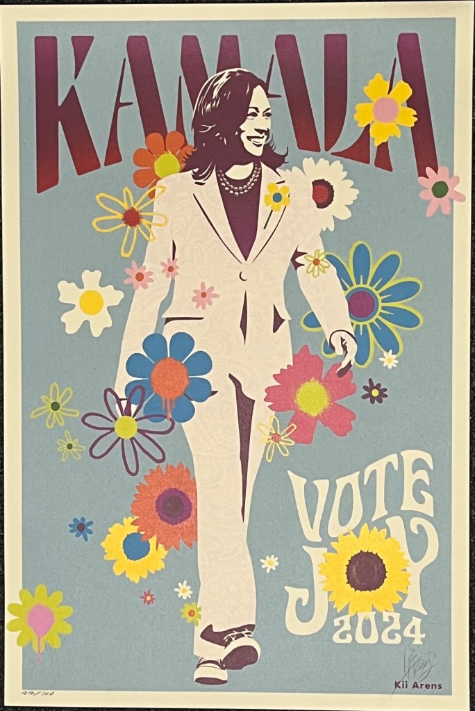
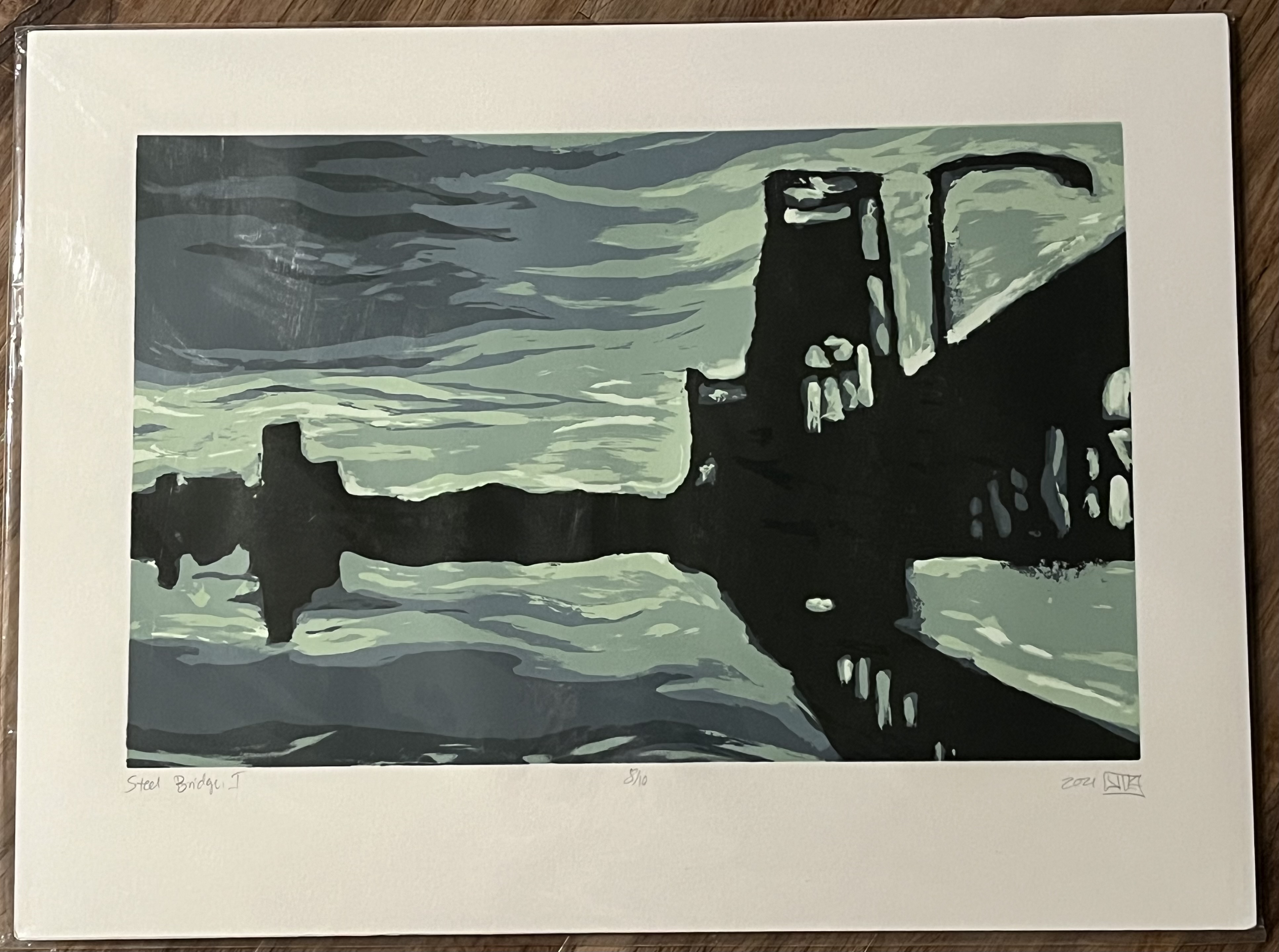
Art Collection

I am not an artist. Nor am I a “serious” collector. But I do enjoy having art, and I am happy to share some of the pieces I’ve collected over the years.

Halim Flowers

“Audacity to Love (IP) (Blue)”

Halim Flowers is an artist based out of Washington, D.C. who served over twenty years in prison after being convicted of felony murder as a juvenile. After his release, he picked up painting and has shown work at galleries and exhibitions around the world. I met Halim at an event at Lewis & Clark College honoring civil rights attorney Ben Crump. Crump and Flowers had worked together on issues related to mass incarceration and criminal justice reform, and Flowers presented Crump with an original painting that blew me away with its power and impact. I immediately went up to Flowers and asked if he had any prints for sale (instinctively recognizing I could not afford a unique piece).

This silkscreen print is an adaptation of Flowers’ “Audacity to Love”. Made in the midst of the Israel/Gaza war following October 7, the colors are meant to evoke the flags of both Israel (blue and white) and Palestine (red, white, and green), “promoting love between both flags and people.” As much as I admire its beauty–the soft yet strong blue bringing out the surrounding colors, the clasping heart simultaneously embracing yet in tension–the message is even more moving. The point of this image, as I see it, is not to deny the existence of well-earned fear, mistrust, or even animus. Rather, it is to accept the reality of those sentiments and nonetheless promote the choice to reach out in love anyway–an audacious choice, but a necessary one.

30″ h x 22″ w, silkscreen (signed, numbered 3/10) (2024)

Joan Miró

“Ma de Proverbis”

A famous Spanish surrealist; my dad bought this print at an art auction in the 1980s. He said it was neither an original (couldn’t afford that) nor a reproduction, and tracking down its exact identity was a bit of a challenge (there appear to be many different versions of this print). My best guess–and it is a guess–is that this was part of an edition of 1500 printed for a book of the same name by Japanese poet Shuzo Takiguchi, since of all the versions I’ve seen this one seems to match up to what I have most closely.

I have it hung directly across the hall from “Audacity to Love”, as I think Miró’s abstract style pairs well with similarly surreal stick figures and eyes in Flowers’ work. A friend said that the images reminded her of the Minions from Despicable Me, and now I can’t stop seeing it–fortunately, for me at least it adds another dimension to the painting (I think Minions are adorable).

14.75″ h x 21.5″ w, lithograph (signed in plate) (c. 1970)

Yaacov Agam

“Three Movement(s) (II)”

This was another 1980s auction purchase by my father, which appears (though again, I’m guessing a bit here) to be an Artist’s Proof of “Three Movements” by famed Israeli kinetic art specialist Yaacov Agam. If you’re wondering about all the parentheses in the title, it’s because I’ve seen this piece rendered with and without the “s”, and with and without the “II”.

While more geometric than some of the other abstract pieces I own, it plays with white space beautifully while still catching the eye with pops of color. It is reminiscent of old computer printing and 8-bit art–one can almost imagine it as a grouping of levels in an early platformer video game, yet somehow stripped down to an even more basic essence.

17.5″ h x 33″ w, serigraph artist’s proof (signed in plate) (c. 1971)

Barry Callahan

“Pros and Cons”

This was the first piece of original art I ever purchased, at a street art fair outside my apartment in Champaign, Illinois. I had just moved there after graduation, and, although I was down to my last $100, I was so taken by this picture that I bought it on the spot. The foreboding clouds overwhelming the otherwise lonely kite-flyer–a fundamentally whimsical activity–made for a fascinating juxtaposition, and it seemed apt that the kite itself would resolve into the rarely-seen “neutral face” emoticon.

I never did get the artist’s name, and for many years I just enjoyed telling the story of my “starvation art”. But over a decade later, I managed to identify the artist: Barry Callahan. He told me that this piece was one of the first he ever sold at an art fair, and that it was “based on the idea that whatever brings you true joy in life can also make the heaviest burdens feel light as a feather. Life will always have hardships. But it’s once in a lifetime when you find true joy.”

8″ h x 10″ w, acrylic (unique) (2011)

“Signal from the Far Shores of Memory, Pt. 1”

After we reconnected with Barry, we wanted to add some companion pieces from him to compliment “Pros and Cons”. “Signal” is the first in a five part series that explores “unlocking memories from a moment in time that were forgotten.” The green dot represents the present moment that triggers the memory; the subway represents traveling back through one’s self-conscious to recall the moment which had been lost.

Topically, of course, it resonates with us rediscovering with Barry after over a decade. Aesthetically, it pairs very well with “Pros and Cons”–a similar color palette, and thematically still similar in evoking a simultaneously depersonalized and yet deeply human urban experience.

12″ h x 12″ w, collage on a refurbished record mailer (signed, unique) (2024)

“A Function of Angle (Kestrel)”

“A Function of Angle” is a series “based on one bird and their roles, the sense we use to observe them, and the color of each muse.” Each graph is the UV frequency of the relevant color (here, yellow). The kestrel (second in the series) is renowned for its keen observation, and so sits perched on the yellow UV line, looking out onto the viewer.

We have this painting across the hall from Callahan’s other two pieces, in what we are jokingly referring to as “the Barry Callahan wing” of the house.

24″ h x 18″ w x 1″ d, mixed media on canvas (signed, unique) (2024)

Todd Miller

“Grain Belt and Riverboat”

Todd Miller is a Minneapolis-based artist specializing in manipulated photography. I first encountered his work hanging on the wall of a local pizzeria in our neighborhood in Minneapolis. While we loved the colors and composition of this photo, we were particularly taken by it because in the background you can see the apartment building we were living in at the time (it’s the orange and blue one).

That same year, we learned this piece won third place in the 2012 American Award Awards (Manipulated Photography–Landscape category).

20″ h x 16″ w, manipulated photography (signed) (2012)

“First Lutheran in Fog”

This was the other Todd Miller print we bought from his exhibition at our neighborhood pizzeria. The image depicts several downtown Minneapolis landmarks, including the First Lutheran Church and Foshay Tower, disappearing into a winter fog. Though having its roots in a photograph, the picture looks almost pencil drawn.

Once as a teenager, I went hiking in New Hampshire. Standing at the peak of the mountain, I looked out into a thick fog of impossibly deep white. There was no view to speak of–you looked out over the edge and it was a completely blank canvas. I turned to my friend and said “it’s as if someone stopped drawing the world.” In this picture, too, the buildings’ disappearance feels less like a natural event and more as if they were erased–the world ending at the edges of the drawing.

16″ h x 20″ w, manipulated photography (signed) (c. 2012)

Tobin Floom

“Voodoo BW”

We met Tobin Floom at the Portland Saturday Market, where we were immediately struck by how he played with color to evoke urban life. A brief conversation revealed that he actually is our neighbor–he lives less than a mile from our house!

This picture is a depiction of Voodoo Donuts, a Portland institution, and is our first piece of art that represents our new hometown. The playful pinks stand out against a mostly black and white backdrop, a sugary-sweet impact that matches a Voodoo’s absurd donut creations.

36″ h x 24″ w, manipulated photography on Sintra (signed)

“Sno-Daze 2009”

Also known as “Anytown USA”, I first saw this print while browsing in a gallery a few days after purchasing “Voodoo BW”. It was unlabeled, but once again I appreciated the juxtaposition of the bright, almost cartoonish reds against the pure white snow and the muted, painted greens.

When I learned it was another piece by Tobin Floom, I was tickled beyond belief–clearly, he has a style that was tailored made for me!

12″ h x 18″ w, manipulated photography (signed)

Kristine Kordell

“Steel Bridge I”

Another Portland Saturday Market find, and another serendipitous connection–Kristine Kordell grew up just up the road from me in Gaithersburg, Maryland. Like with Tobin Floom, we appreciated the sense of place in Kristine’s work. This silkscreen–part of three series of ten each (each series a different color palette)–is a depiction of Portland’s Steel Bridge, which we cross regularly on our way to sporting events at the Moda Center. Despite the fluidity of the lines, it still manages to convey the power and strength of what was (and remains) an architectural marvel.

Indeed, what I like about this piece in particular is that it avoids two common poles one often sees in cityscape art–either being too on-the-nose in presenting sharp, literal piercing lines, or deliberately running all the way in the other direction of into fantastical whimsy. Both of those styles can be appealing (and often appeal to me), but this work felt unique in being impressionistic while still maintaining an intense, even foreboding visage.

13” h x 19” w on 18” h x 24” w watercolor paper, silkscreen (signed, numbered 8/10) (2021)

“Steel Bridge Study in Orange”

As we were ringing up “Steel Bridge I”, we saw this original piece nestled in the corner. Originally part of a study used to create the “Steel Bridge” series, Kristine converted the photos into a unique piece of art that presents the Steel Bridge in a novel and impactful way. Though the photos themselves are “literal”, the juxtaposition (particularly of the Steel Bridge against a robust wooden background) deconstructs the linearity of the bridge and elevates it into something that commands a different sort of attention.

At the time we purchased this, we discovered that it didn’t even have a name yet! So we had the fun experience of collaborating with the artist to give it its formal title: “Steel Bridge Study in Orange.”

23” w x 8” h on a wood block 25” w x 13” h, mixed media (signed, unique) (2018)